About ACE for Unions
This project was built in 2023 while I was at 5S Technology. Background info for this client, the product, and its users is available here.
My role
I was the sole designer at 5S Technology and involved in this project from concept to rollout.
Users
Delta Air Lines pilots used the ACE mobile app to report suspected contract violations to their union (our client).
Delta Pilots Union admins would review the reports, get more info from the pilots, and, if a violation had occurred, file a claim on the pilot’s behalf.
The first draft
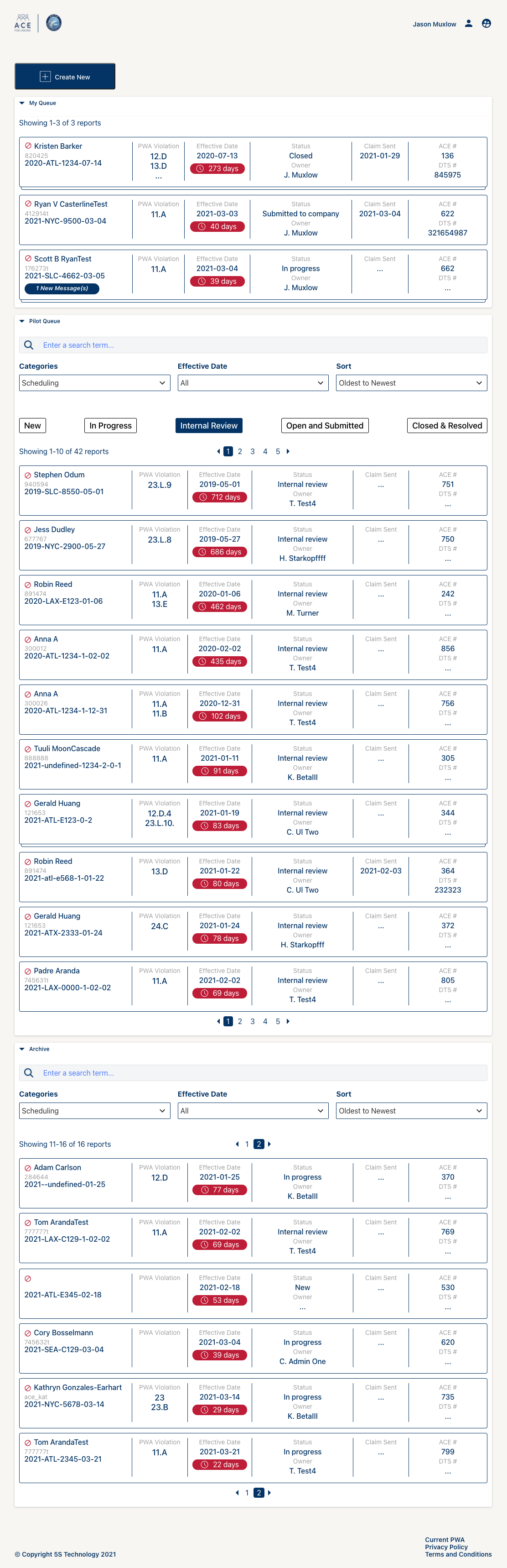
Before I was hired, the team built a product based on the union’s spec:
- 1 pilot per report
- 1 report per claim
- 1 violation per claim
The screen to the right shows that early design.
Big chunky rows represent the reports, and in and of themselves are quite nice. Lots of data, easy to read.
By the time I arrived, pilots had taken to the app in a major way, and what was expected to be a manageable flow of reports from pilots in the field had turned into a deluge. There were thousands of reports in the pilot queue waiting for attention.
Three big collapsible sections hold different kinds of data:
- My Queue — Reports that this user owns and is working on
- Pilot Queue — Reports waiting for attention
- Archive — Reports for incidents that were found to be compliant with the contract
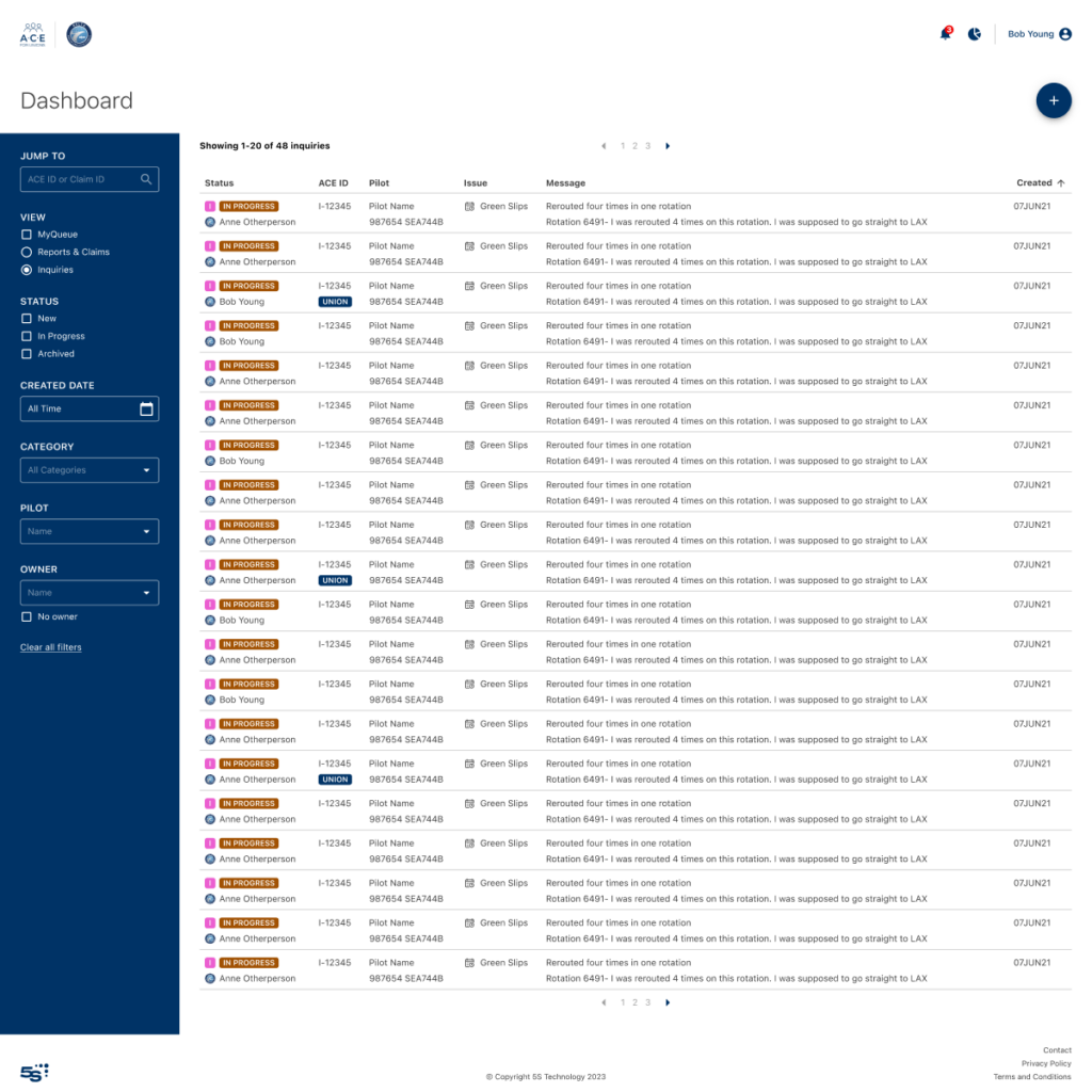
That meant that every time the page was loaded, a lot of unnecessary data was being loaded for users who just wanted to see what they were working on, or look for a new report to address.
We had also refactored to allow multiple reports per claim, which is indicated in the original design, but users can’t see any info on the additional reports without opening the claim.
We had also introduced Inquiries for pilots who didn’t had a question, and didn’t necessarily need to file a report.
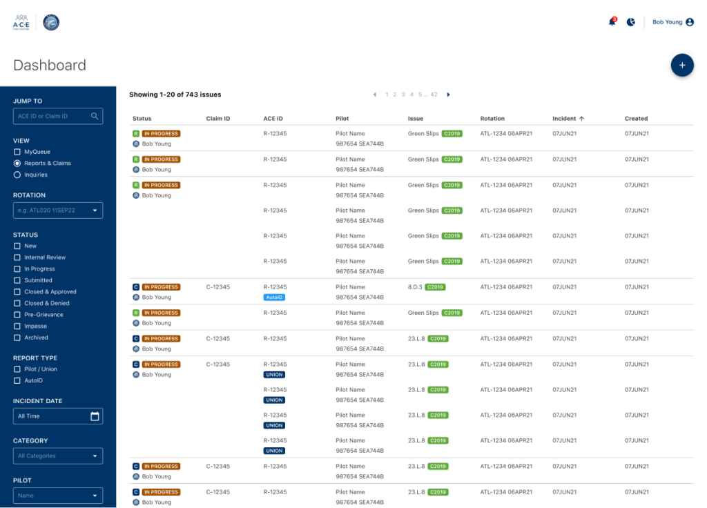
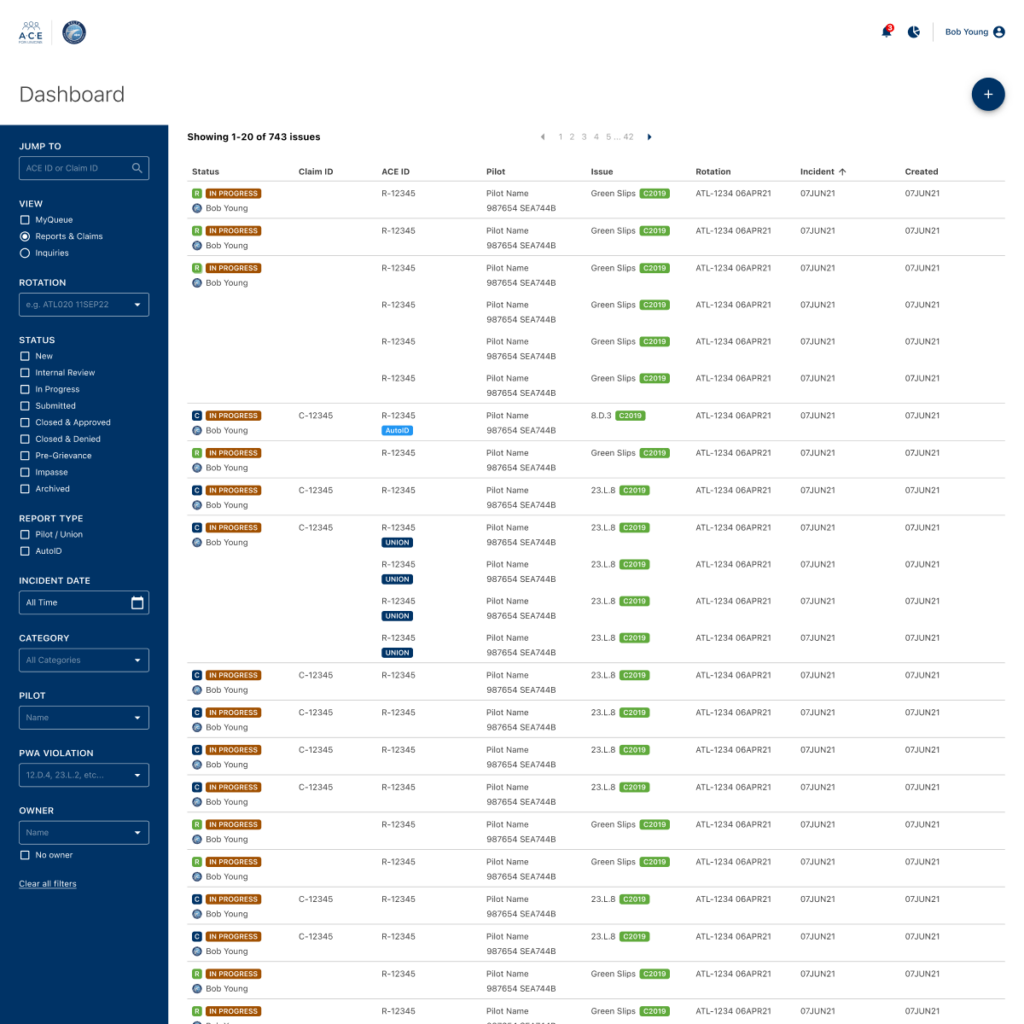
Redesign objectives
While there was nothing technically wrong with the original design, users wanted something a bit more traditional, streamlined, and efficient.
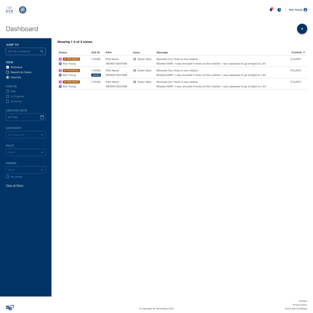
Our team also wanted a more traditional table design with slim rows, sortable columns, and filters in a sidebar. Users also had to be able to easily and intuitively switch between Reports & Inquiries, and the full queue or “My Queue”, i.e.: just the items they owned.
Key things had to be clear in the rows:
- Who if anyone was working on a report or inquiry
- Status of the item
- Various IDs
- Category the report or inquiry was filed under, or the violation code if a claim was being constructed
- For claims containing multiple reports, all reports had to be visible (only the first would sort/filter)
Lastly, reports and inquiries had their own sets of columns and filters, and filters needed to be disabled when viewing My Queue.
Screens
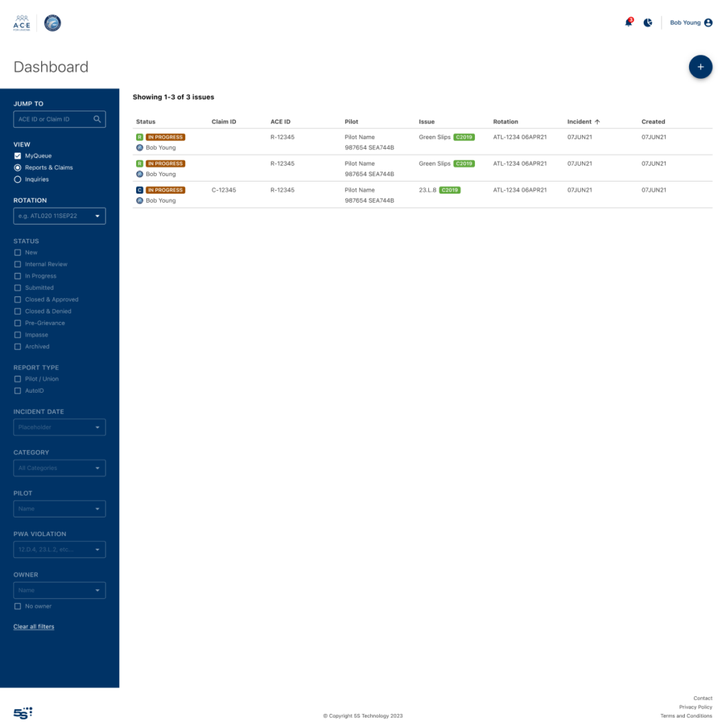
Results of redesign
- Only data that was specifically called for by the user was loaded
- Union admins had an easier time managing their work
- Union managers had an easier time keeping tabs on the overall state of the queues